
Tools Used
Roles
Adobe XD, Google Slides and Adobe Premiere Pro
Design Researcher and UI/UX Designer
Table of Contents

Executive Summary
The purpose of our research is to identify the most problematic areas of the YRT app and create fixes. We found that almost half of our users struggle with or have struggled in the past to understand UI elements, leading to delays in their commute. This confusion was forcing commuters to switch to other transit methods, losing revenue for our company. We successfully implemented a UI overhaul and transformed app usability which will in time lead to an increase in daily riders, growing the YRT business. Our team of researchers has rejuvenated a struggling company and given it life again.
Introduction
The purpose and objective of this project is to encapsulate and explain our research process, the insights found, changes and challenges that we encountered throughout our design research process.
Throughout this report, we will be completing our research and recapping on previous materials that we found benefited the York Regional Transit.
Reasoning In Choosing The YRT App

As I (Sarah) was on my regular route to class by taking the usual transportation which is the YRT bus route. While on I was commuting along the bus route heading to school and heading home I was trying to figure out on what company website or app that my group and I can work on to improve it. I did hear a commotion going on the bus where people were complaining and were frustrated when they were told that the stops they want to get off on are Passenger Pick Up Only or the stops they want to get on are Passenger Drop Off Only which passengers say that they didn’t know that certain stops are Passenger Pick Up Only and Passenger Drop Off Only because it doesn’t appear on the app. I overheard the passengers are frustrated as to how disorganized the app is, as to how confusing it is when trying to use the app and they struggle to figure out if they have to take another bus to get to their destination. After overhearing this that was the reason why we decided the YRT app is a good choice for us to improve the user experience of the app.
Objective & Research Questions
Our research objective that we had for this project was to understand and sympathize with York Regional Transit commuters on their paint points in their user experience while navigating the wayfinding application. We sought out to find ways to try and improve it to serve the local using the service.
Here are the research questions that we used to find more information about our user for our initial prototype:
- How can we enhance the user experience on the York Regional Transit app, specifically for those seeking commute routes?
- How do commuters plan their commutes, if at all?
- What features are the most important to YRT users?
- How can we get YRT on-par with major public transit provided by cities?
- How can we attract a larger user base to the YRT app?
Target Audience & Timing
Throughout doing our research, we noticed a slight change in our direct target audience from the previous 24-44 years of age. Due to teenagers having a lack of transportation when guardians or parents are at work, or unable to transport them, especially when in groups, we believe that our updated target audience are from the ages of 16-36 years of age.
With our target audience having such a drastic difference from the low-end to the high end, we believe that while the younger generation have been born into using technology, they are not much more advanced with using wayfinding or navigation systems.
Methodology
Our primary methods of conducting research was through Observational Research, and Surveys.
The observational research was conducted by asking individuals to complete a set of tasks within the established YRT wayfinding app and noting their actions, feelings, number of clicks.
The survey research helped us gain insights on why users were choosing to stray away from the YRT wayfinding app for other competitors. These insights allowed us to implement core features and QOL changes to the UI of the prototype we were creating.
Research Findings
Key findings from our primary research conducted on our test user was feedback, critiques and quotes that were used to further benefit the prototype, before arriving to the developers.
Here are the following findings:
- Test subjects described the interface as “well-illustrated flow”, with a few inconsistencies.
- Usability issues with the prototype’s navigation bar, causing uncertain results
- Difficulty seeing available routes
- Difficulty successfully understanding iconography
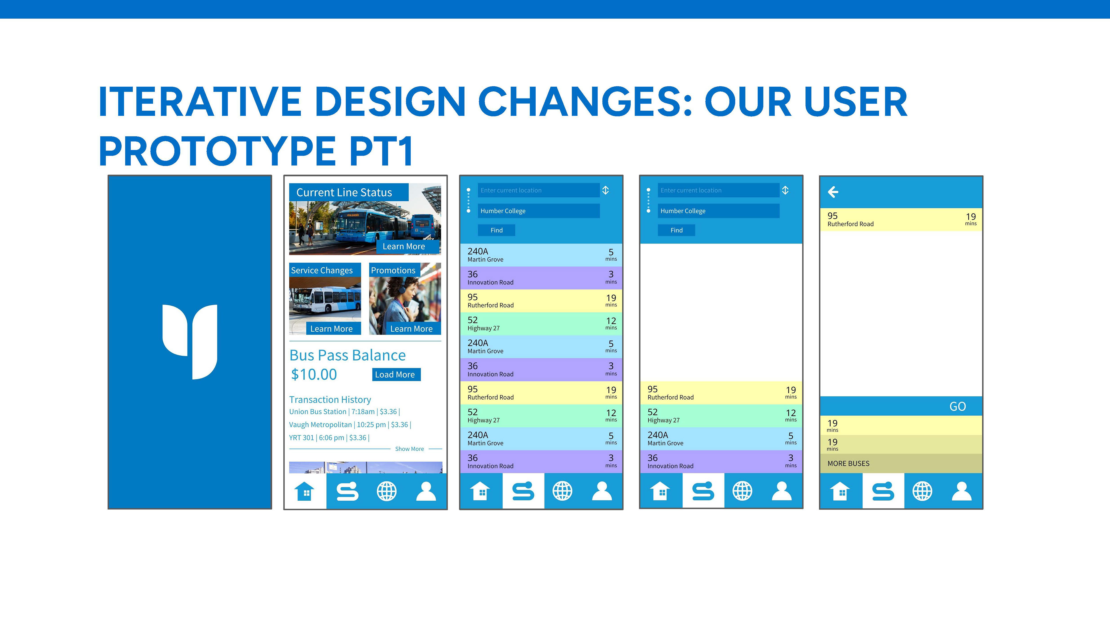
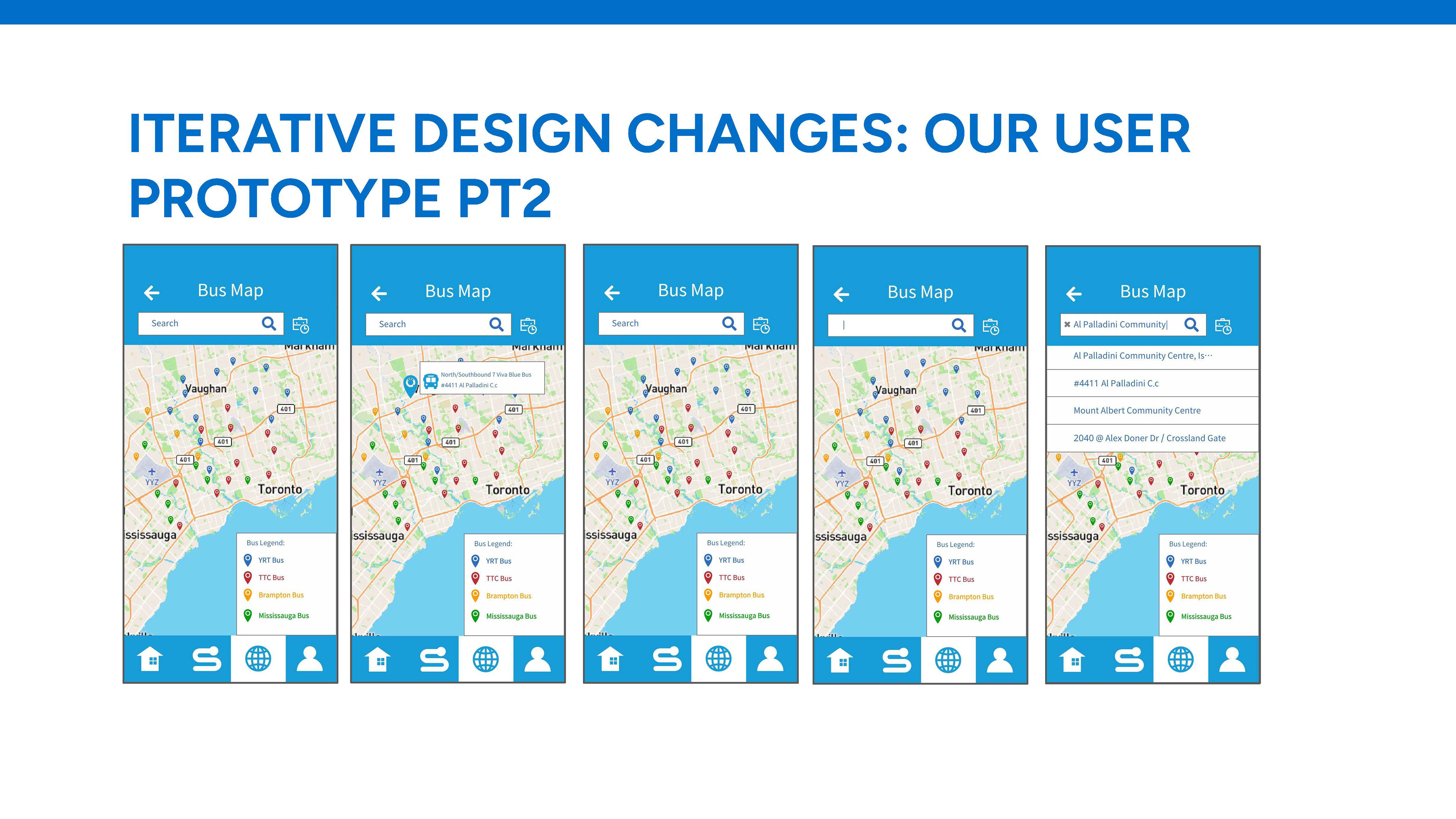
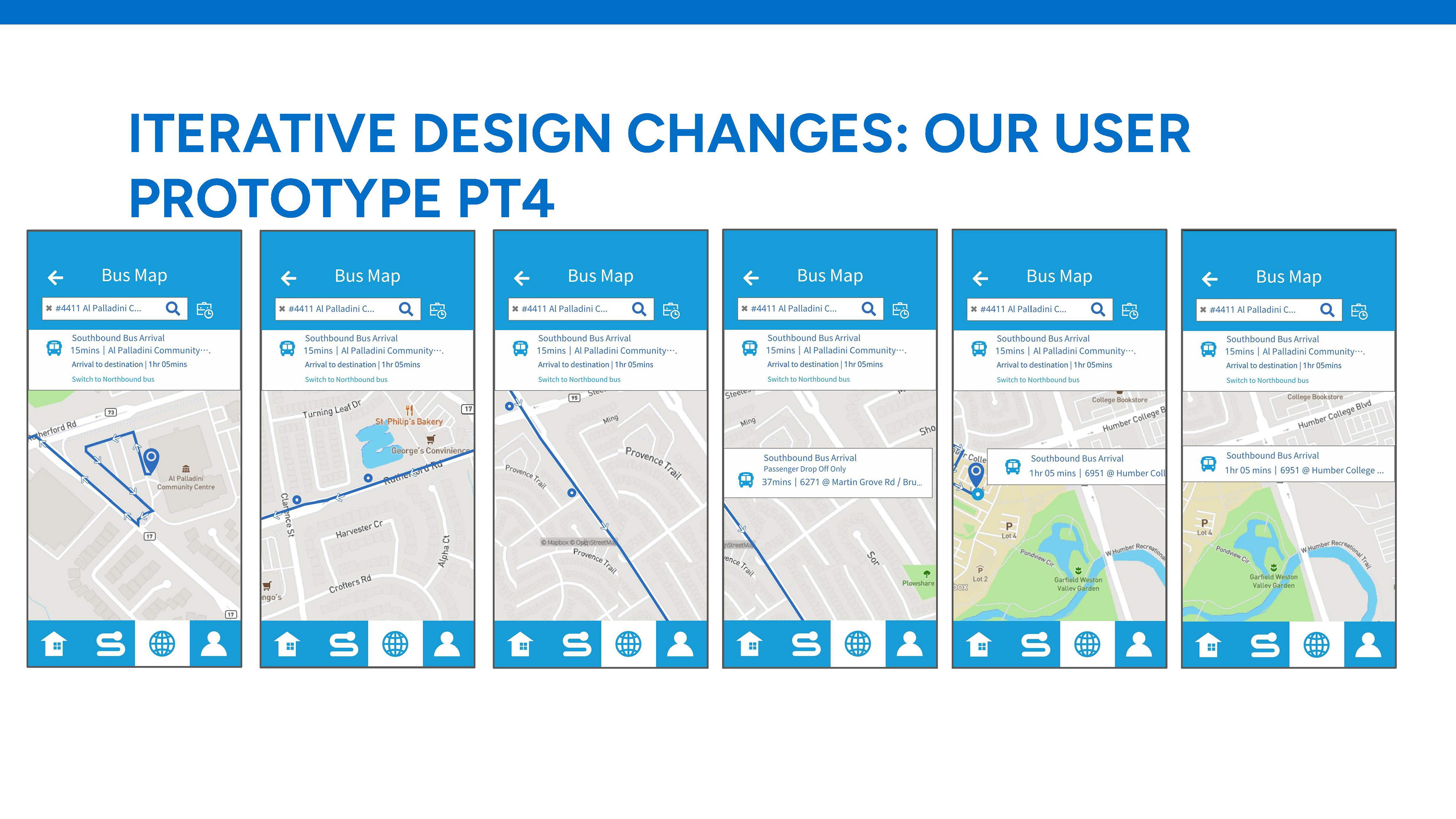
Iterative Design Changes

Iterative design changes that we sought out to change based on our usability testing on our prototype was the overall direction of the interface styling. Upon opening, the users are greeted with a simple Interface showing bus pass information, a tab for service changes, current line status, and active promotions.
The main menu bar contains only the most important features, including routes, bus schedules, account settings, and the home button. This allows the app to be easily picked up and used by anyone within our desired age range as well as those who are outside of it.
When creating the UI for the in app map, we wanted to heavily simplify the information presented to users. Decreasing visual clutter was our first goal and we achieved this by changing the size and density of route icons, as well as adding a clear legend explaining the different routes available.
Iterative Design Changes: Our User Prototype


Recommendations
- Address inconsistencies in the interface styling for a more cohesive and well-illustrated flow.
- Resolve usability issues in the navigation bar to provide users with a smoother experience.
- Enhance visibility of available routes to reduce user difficulty in finding the desired information.
- Add a clear legend to explain different routes, improving overall map comprehension.
Conclusion
Overall, we believe we’ve made a significant improvement in the usability of the YRT app and transit experience. We successfully identified the most problematic areas of our UI, and after conducting extensive field research we were able to pinpoint our problems, such as difficulties identifying iconography and route information. After deliberating as a team, we came up with several resolutions that we felt made our app significantly more user friendly. After implementing our changes and conducting field research with our peers, we received much better reviews and feedback, and users had little to no struggle using the app, therefore showcasing our success in our redesign.


For my Design Research assignment, I had to work in a group through out the semester where we had to decide on what app we should work on that needs to be improved on. As a group we decided to chose to work on improving the YRT app for the assignments throughout the semester for our Design Research class.
When working on this project, we had to identify what problems on the app that needs to be improved on and how do we solve that problem. We did some design research where we went through the app we identified the problems that you need to download two apps to use the app, there is no area on the app that would say that certain bus stops are passenger pick up only or passenger drop off only and I noticed that passengers would complain as well as get frustrated when they didn't know that certain stops are Passenger Drop Off Only or Passenger Pick Up Only since it doesn't say that on the app. I also overheard some passengers on my bus route complain as to how complicated it is to use the app when they trying to figure out what next bus they would need to take in order for them to get to their destination. After identifying the issues of the app, we started brainstorming ideas on how we can improve this app. Once we finished brainstorming ideas, we used Adobe XD to create the wireframes and high fidelity of the app we are improving on. Once we made the improvements on the app, we then did some research where we asked people if they wanted to test the improved user interface that we improved for the app. Once we received feedback from them, we made any necessary changes that we needed to make for the app. My group and I were successful in making improvements in the app where it is simpler, easier to navigate and we solved the problems that we identified in the app.
References
Images:
- About Us. York Region Transit. (n.d.). Retrieved from https://www.yrt.ca/en/about-us/about-us.aspx Accessed on Thursday November 29, 2023
- Jones, J. (2023, November 8). Amazon makes big change to audible pricing for Black Friday. The Mirror. Retrieved from https://www.mirror.co.uk/money/shopping-deals/amazon-makes-big-change-audible-31381276 Accessed on Thursday November 29, 2023
- drum118. (2023, December 3). YRT (york region transit) 1516 novabus LFS bus at YRT Bus Terminal for Pioneer Village Subway in Vaughan City. Flickr. Retrieved from https://www.flickr.com/photos/drum118/45234513041 Accessed on Thursday November 29, 2023
- York Region. (2023, October 17). York Region Transit (YRT). Retrieved from https://www.york.ca/transportation/york-region-transit-yrt Accessed on Thursday November 29, 2023
- NewmarketToday Staff. (2020, September 28). Traveller on multiple YRT bus routes tests positive for covid-19. NewmarketToday.ca. Retrieved from https://www.newmarkettoday.ca/coronavirus-covid-19-local-news/traveller-on-multiple-yrt-bus-routes-tests-positive-for-covid-19-2749832 Accessed on Thursday November 29, 2023
- About Us. York Region Transit. (n.d.). https://www.yrt.ca/en/about-us/about-us.aspx

